Margalita
Brand identity / Restaurant
Margalita is a Georgian family restaurant rooted in family recipes, wine, music and Supra culture. The rebrand preserves this heritage through a visual identity inspired by Georgian winemaking, vines and traditional decorative forms.
REBRENDING EXPLORATION
LOGO CONCEPT
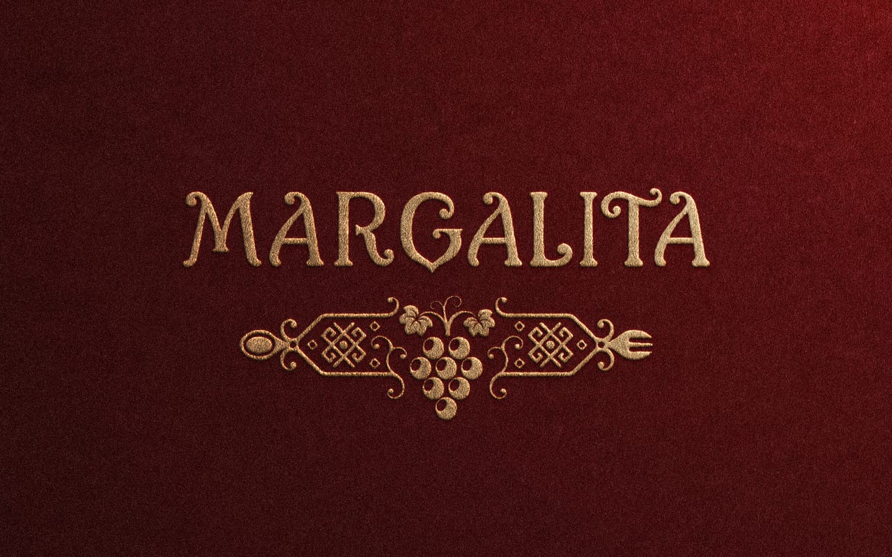
The new Margalita identity refines the original logo into a cleaner, contemporary system. Georgian ornament, vines and grapes connect the brand to wine, the Supra and tradition, the pearl-like cluster links directly to the name - “margaliti” means “pearl” in Georgian. The custom “G” echoes a Qvevri, adding another subtle reference to Georgian wine culture.
MESSAGE CONCEPT
At Margalita, guests are welcomed with family recipes, wine and the warmth of Georgian hospitality. Here, shared meals, familiar faces and new encounters become part of one continuing Georgian tale.
- Studio
- Questar Studio
- Collaborators
- Nina Iremashvili · Nikoloz Kiknadze
- Project type
- Rebranding exploration